Reference books are the ultimate authority. If you don’t know what a word means, the dictionary does. If you don’t know when the tide will rise, the almanac does. If you don’t know where a city is, the atlas does. Reference books are detailed catalogues of human knowledge, and they’re not up for debate either. They are authoritative and complete. So imagine my surprise when I found a reference book on color.
I was browsing the depths of the library’s science archives when I found a reference set titled Colour Index. It was a collection of nine volumes, each one weathered like an ancient sage. Together, they spanned nearly half the shelf, a monolithic structure containing everything there was to know about color. It was a lot to take in, so I decided to start at the beginning. I pulled the first volume off the shelf, expecting to see a brilliant red or a stark white, or maybe a different color altogether.
My disappointment was immeasurable, and my day was ruined.
There were no actual colors in this book of colors. Each page was just black text on weathered paper. I checked the rest of the volumes, but they were all the same. Each volume was filled with entries about chemical dyes and their various properties, including printing, fastness, and non-textile usage. This wasn’t a reference for color. It was a reference for which dyes do what, created by the Society of Dyers and Colourists.
Among those chemical properties was a description of the color, which isn’t quite the same as a book of colors, but it’s at least a consolation. I started reading a few entries, but I quickly ran into a problem. The color descriptions weren’t all that descriptive. I read an entire page where the description for each dye was just “blue.” Not navy. Not cobalt. Blue.
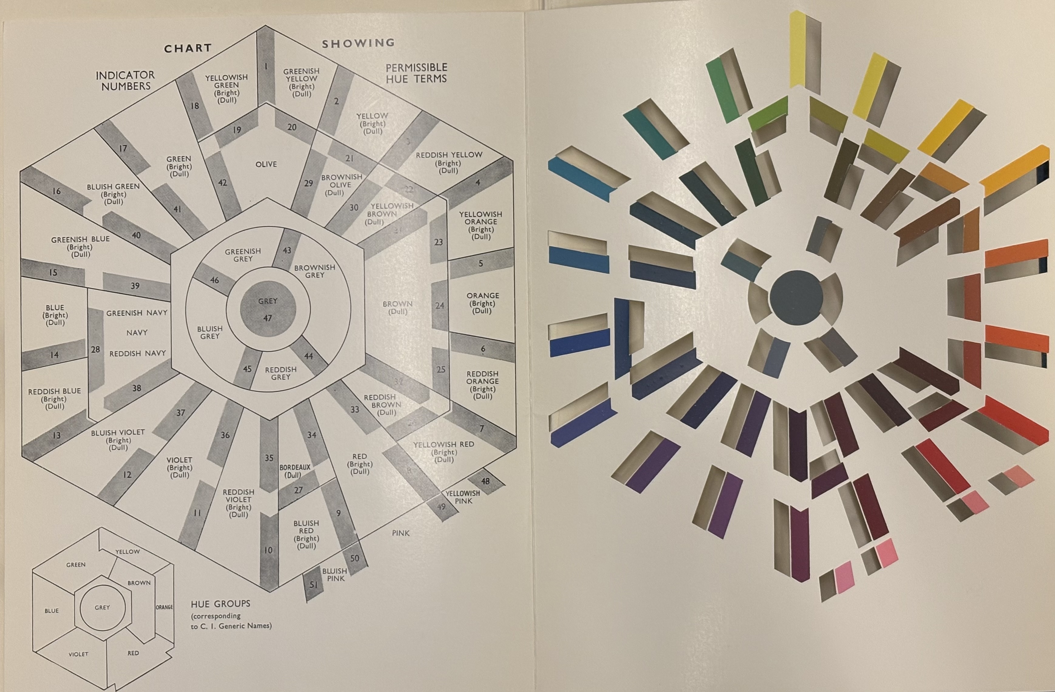
Across these 9 books of color, there were only 47 colors. That’s fewer than 6 colors per book. After digging a little deeper, I realized there were two reasons these books only had 47 colors. The first was that dyers only cared about the hue—the type of color—like red, yellow, or purple. Dyers can essentially ignore intensity and brightness because once you have the right hue, you can adjust intensity and brightness yourself. If you have a blue dye already, you can make it lighter or darker yourself. The second reason explains why they only used 47. Each hue needs to be clearly distinguishable, so limiting the number of hues to 47 rather than something like 1000 means there’s no ambiguity between hues. Each one is distinct.
Forty-seven colors is not a lot, especially when you can get 64 colors in a standard box of crayons, but now might be a good time to remember that colors don’t exist. Colors are what happens when our brains try and process the electromagnetic radiation detected by our eyes. It’s possible to make some loose connections between the wavelength of light and the color we see, but it’s all very subjective. Instead, color is just a tool we use to understand the world. It’s informed by light, surroundings, language, and the individual perspectives we apply to the world.
These 47 colors are also just a tool. The Society of Dyers and Colourists likely acknowledges that others may see colors differently, but for them, their system of 47 colors is a useful tool for their job. In the same way that children learn 6-7 colors in the rainbow, computers use 16.8 million colors, and physicists consider infinite colors, there is no one right way to approach this problem. Each system of colors is correct for the purpose it serves.
By this point, I understood the reasoning behind the 47 colors, but I still didn’t know what they looked like. That was until I looked inside the back cover of the first volume. There, I saw it. A thinly-laminated cardstock diagram with all 47 hues. It held up surprisingly well for being printed over 50 years ago. Each hue had a slit next to it, so you could compare it to an actual object. For example, my sweater was #40, green (dull).
I opened this reference set expecting it to be an authoritative guide to color, and while I might have been wrong, I was also right. Reference sets are more than vessels filled with knowledge. They are cultural artifacts that share the priorities and perspective of a community frozen in time. The authors of reference sets must carefully choose what information is included and what gets left out. Dictionaries, almanacs, and atlases only contain information they find relevant to their community. The same goes for the Colour Index. This reference set, like others, is absolutely authoritative and full of knowledge, but it is ultimately a human invention made for other humans. Different people will have different opinions on what should be in a reference set, and that’s okay.
Color is a matter of perspective. Everyone approaches it differently for their own, unique purpose. This reference taught me a new perspective on color, one I might have never considered. In this way, saying this reference only has 47 colors understates just how much there is to learn from the Colour Index.
References
- Colour Index, Society of Dyers and Colourists. American Association of Textile Chemists and Colorists, 1971.